Magical Meadows
Therapeutic Horseback Riding
Logo & Identity Design, Graphic Design
Building a Service-Centered Brand
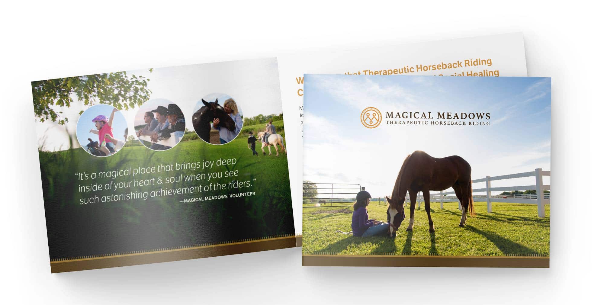
When The Magical Meadows contacted us, they described their services as therapeutic horseback riding, but we quickly realized that they offered much more. All it takes is a visit to their beautiful property to realize they are also a safe haven and a place of quiet and peace in an noisy world.
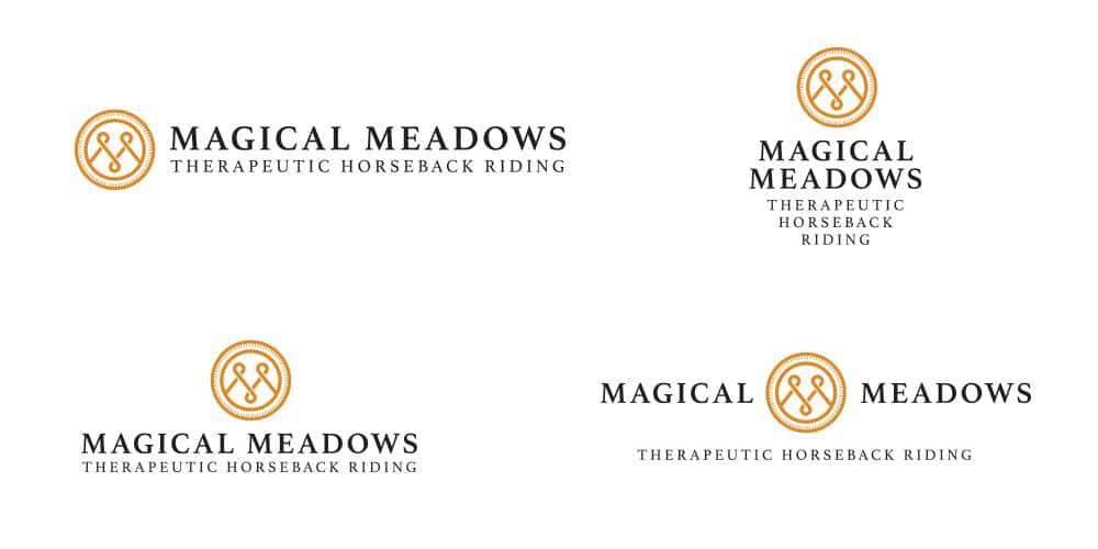
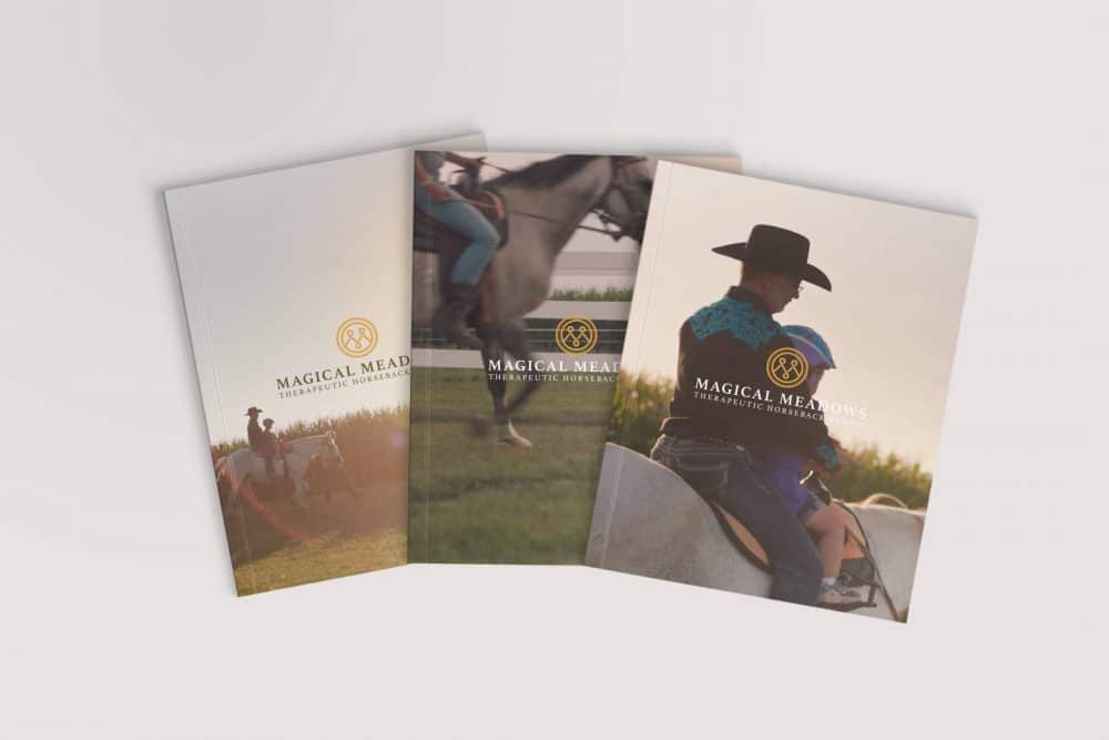
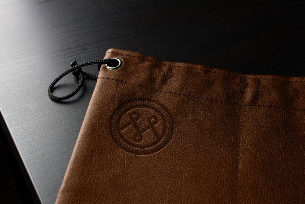
We attempted to capture this tranquility in their logo and identity. The styling of the logo is inspired by the ranch logos we saw during while traveling through the open spaces of the South West. The logo features an monogram with focal points representing the 3 aspects of a horses movement (up/don, right/left, back/forward), as well as the three aspects of healing provided by The Magical Meadows Services.
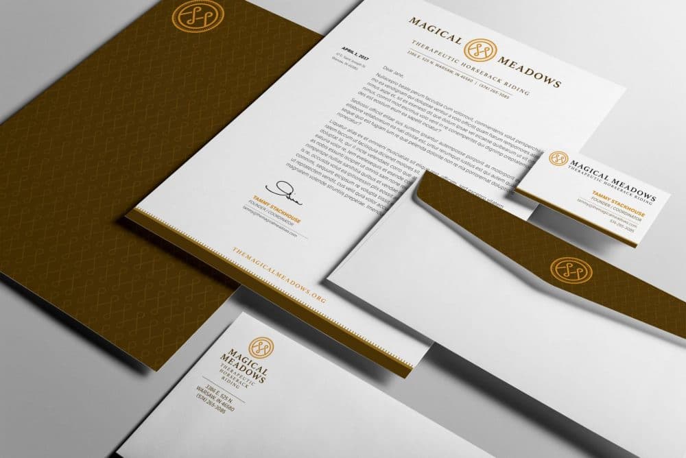
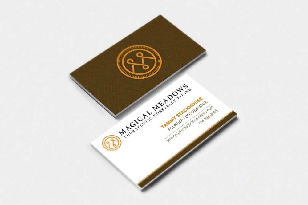
Once the logo was complete, we developed a complementary identity, worked with Marah Grant Photography to curate a beautiful photo library, and hired 1eighty Digital to create a world-class website.
