Chez du Barry
Artisan Bakery
Logo & Identity Design, Graphic Design
Telling a Story Through Design
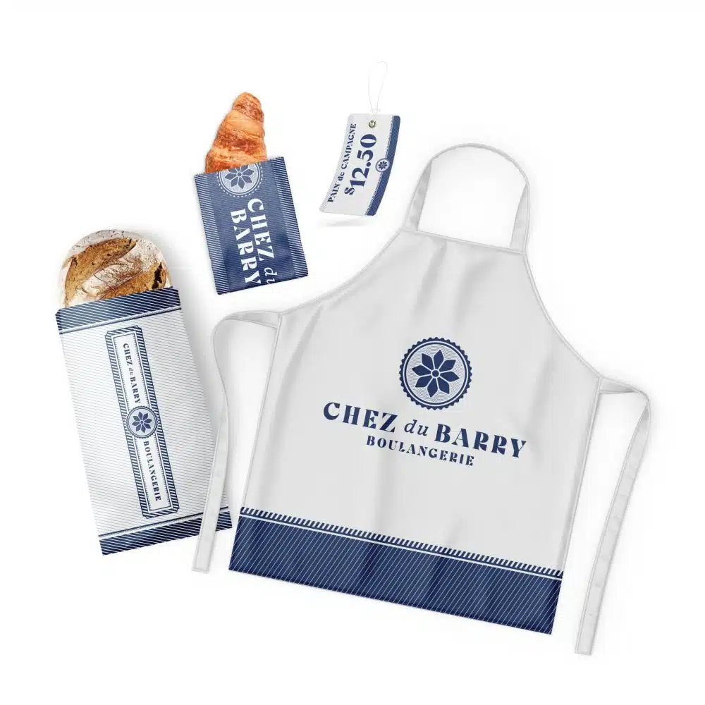
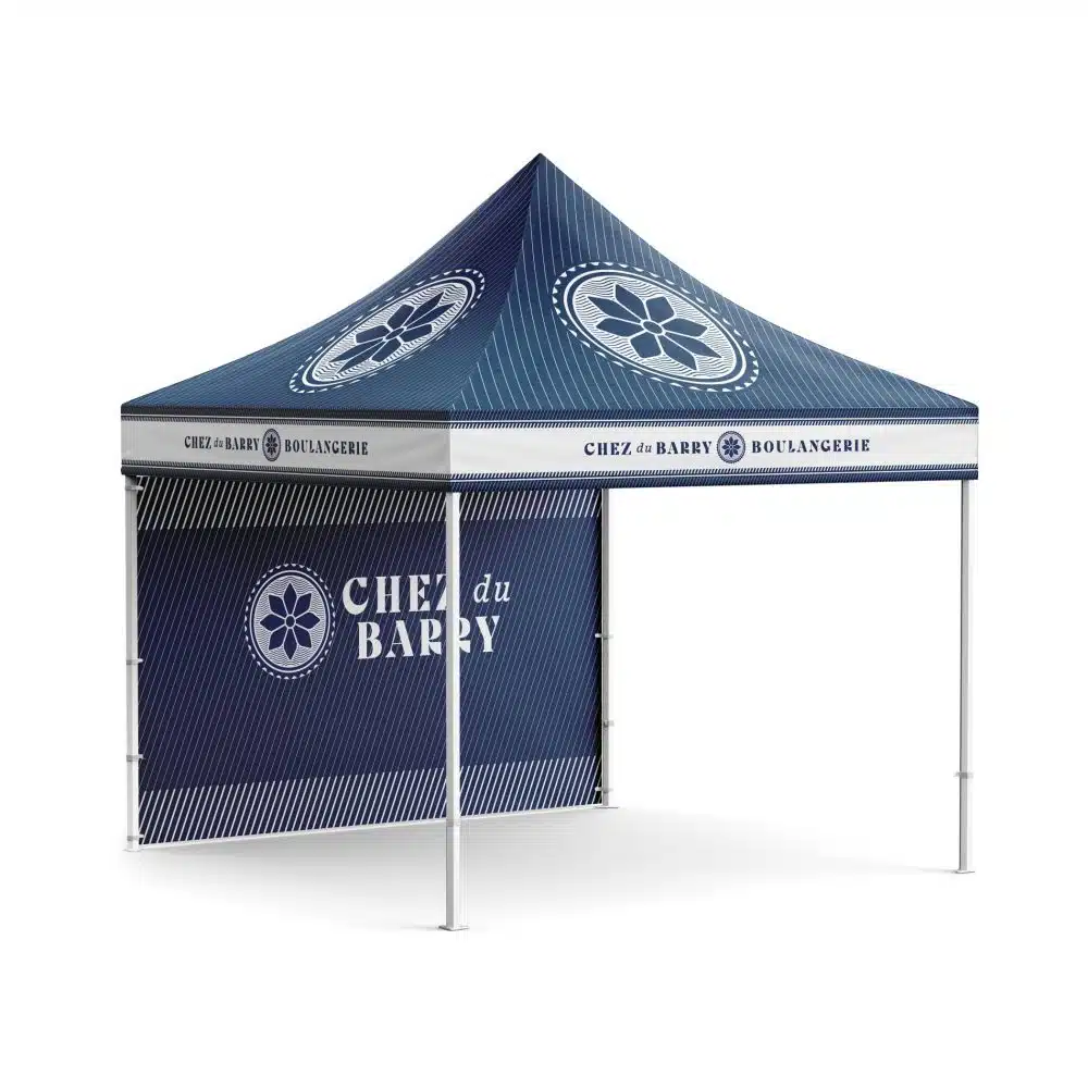
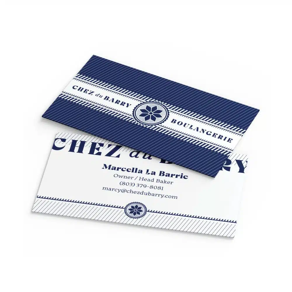
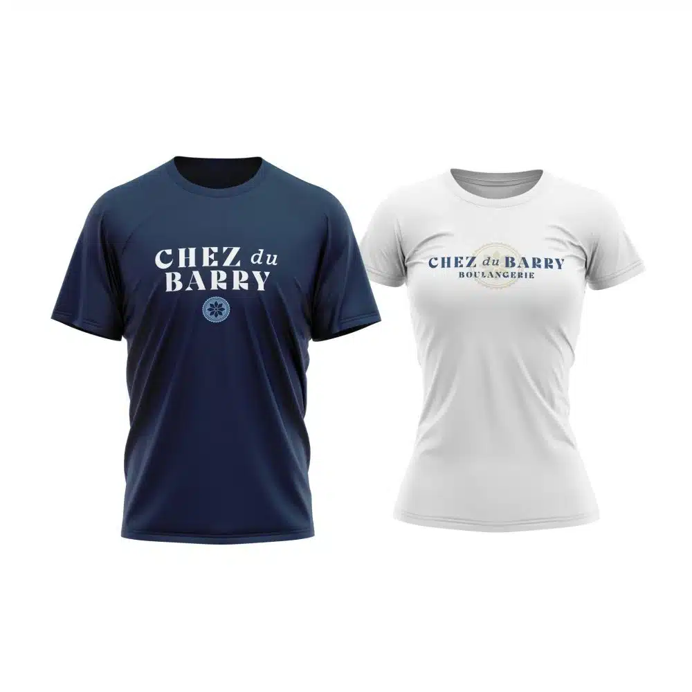
Chez du Barry was established out of a deep love and passion for creating authentic, hand-crafted bread using only a few simple ingredients. Founded with a deep appreciation for the artistry of French boulangeries, the creator sought to bring that authentic European experience to their artisanal bread. Blue Note helped them develop a logo and identity that captured the essence of the boulangeries that initially inspired the creator’s love for baking—but with a modern twist.
Properly encapsulating the historical legacy of centuries-old baking traditions and integrating them into a modern brand identity demanded extensive research and careful attention to detail. Two books of French signage led us to discover the timeless allure of typography and iconography used in historical France. We explored cultural motifs native to the Hates-Pyrénées region of southern France where the Du Barry name originates. There we found a variety of location-specific playing card symbols. The Franco-Spanish suite for coins served as the direct inspiration for the icon in the final logo. The result is a logo and identity that blends the old-world charm of French boulangeries with a contemporary flair.


